Thoughtwax
Design is a Conversation
This is a transcript of a talk I gave at the Rebase conference in Dublin on 2nd October 2015. I’ve also written about some of the ideas below on the Intercom blog but the talk contains additional detail and some killer dad jokes. Thanks to Rebase for inviting me to speak.
This is the title of my talk today: Design is a Conversation. This can mean a couple of things.
First, the obvious one: the process of doing design involves lots of talking. Talking about your ideas with your colleagues. Talking to users to see what they need.
And in some ways design is a dialog with the world: we make all this work and put it out there in the world and see how the world responds, how it reacts. That’s a conversation too, I believe.
But I’m going to focus on two other ways that I think about design being a conversation.
One is just a bunch of interesting things that I’m thinking about at the moment, basically technology trends. Things that are happening and current and interesting. Conversation as gossip.
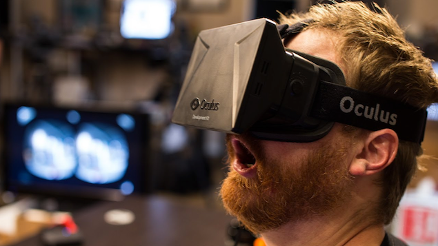
This is the addictive, ever-changing side of technology, the part of what we do that keeps you pulling to refresh your twitter feed like a rat conditioned to get another pellet from the never-ending stream of tech community chatter. This is the part of working in tech that’s exhilarating but perhaps sometimes a little bit like eating junk food. It’s sometimes valid though, it’s an ongoing conversation we’re having with ourselves and what’s happening around us and under our feet.
But the other thing I’m going to touch on throughout is something that’s the very opposite of up-to-the-minute news updates. It’s maybe a bit more reflective than that, and it’s about looking to the past. Because I also think that on a fairly serious level, design can be a conversation with the past.
So, not so much that dude up there as this fellow here:

Here’s someone who has obviously done a bit of thinking about the future. What can we learn from this fellow?
It’s generally considered among intelligent human beings that the past has something to teach us. Yet in the tech world we spend amazingly little time looking to the past for lessons. I suppose it’s because the future is so distracting, so enticing. But it seems like we’re missing a trick, because the past is basically a free cheat sheet for the future! Newsflash: we’re actually not the first people in the world to ever design products. Not only that, it turns out that there are some basic, fairly universal truths and it’s totally fine to copy from the people who figured them out.
So I’m going to also be looking to the past, and to my own past, and thinking about what I can find there.
OK, let’s get started. When we think about the past we think about our own pasts, primarily.
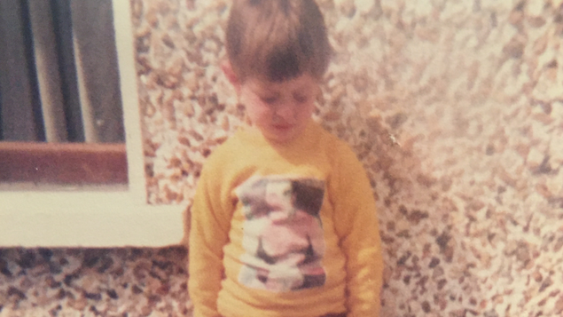
In many ways I think that a lot of what I do today is a conversation with both the past and my younger self. I count myself lucky that I work in a field where I can call on all of the interesting things that I’ve encountered throughout my life, filter and synthesise them into something new. And all of those things come from my past, they are a remix.
It easy to forget that when you’re on the twelfth iteration of horrible usability problem, but anyone who is a designer, your job is basically to take all the stuff you think it cool, and mash them together into something new. That’s quite cool. Five year old you would be impressed, I would think.
From one great man to another. No design conference talk is complete without a quote from either Steve Jobs or Henry Ford, so I figured I’d get this out of the way early and be done with it:
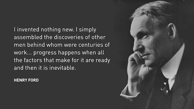
This is what I mean when I say that design is a conversation with the past. It’s almost like a collaboration. It’s a wonderful thing to look at what’s happened and then respond to it in a new way.
Although Banksy perhaps put it better:
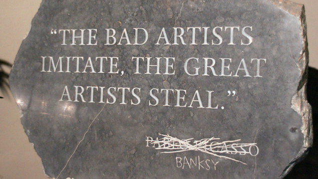
So with that in mind, let us now plunder the past for clues about the future. I’m going to start with a history lesson.
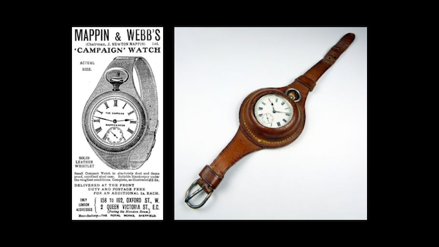
Watches are interesting objects. Wristwatches came to be a little over 100 years ago, not as long ago as you might have suspected. Like many technological advances (computers, the internet) they were a wartime development.
Pocket watches had already been a thing for a couple of centuries. But towards the end of the nineteenth century, synchronizing manoeuvres during war was becoming increasingly important. Using pocket watches while in the heat of battle or while mounted on a horse or while sniping was impractical, so soldiers began to strap the pocket watches to their wrist.
So that’s how wristwatches came about, and perhaps after eyeglasses became the world’s earliest and more popular form of wearable technology. Wearable technology: another interesting conversation between humans and machines, and one that’s been going on for a long time.
As technology developed, people started to pull a Henry Ford and put existing ideas together. Computers and watches were two existing things. So the notion of a computer watch gradually took hold in people’s minds. Although for a long time it’s fair to say that it was more of a sci-fi or comic book trope that a real possibility. Dick Tracy is the obvious reference here although as a child of the 80s I must admit that these are more relevant cultural touchpoints for me.
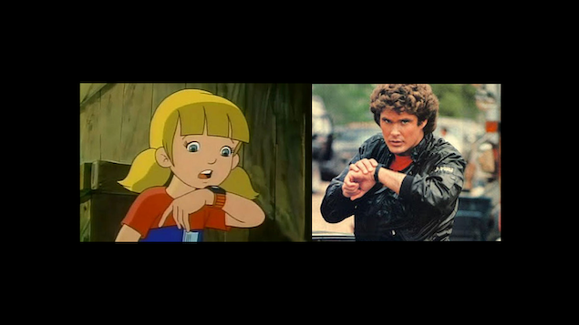
My own background and interest in this type of thing goes pretty far back.
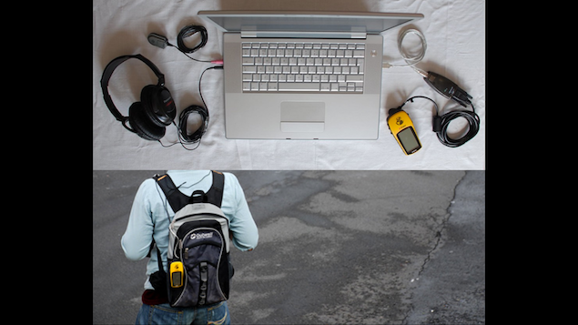
I studied art in college over 10 years ago, and part of my practice involved building art projects that cobbled together portable computers into systems that did interesting things: recording and playing back sounds in certain locations, mapping spaces. Computers were mostly desk-bound, and it was quite different to wear these and go walking with a computer. So I was always partially interested in the adjacent possible for this type of thing.
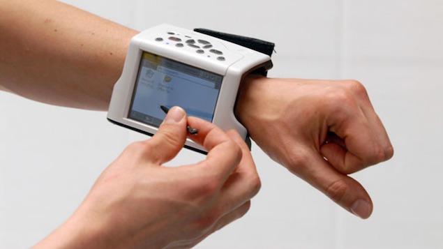
Because of this interest I kept an eye on wearables developments in general. I saw amazing things like this. Small computers were becoming possible and people wondered how you might wear them.
As Chairman Jobs said, “If you see a stylus, they blew it”. So this obviously isn’t right. How do you figure out what is? Again let’s look at what happened in the past and using that as a lens for what might happen in the future.
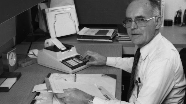
This is Gordon Moore. He worked at IBM for many years. Most of you are probably familiar with Moore’s Law: the number of transistors on an integrated circuit doubles every year and a half. Basically that means that computers for nigh-on 50 years now have been getting faster at the same pace.
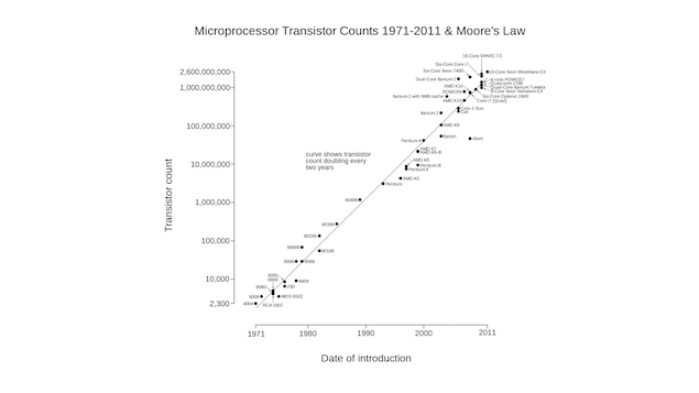
This, for me, is the single most interesting chart in the history of technology. Here we’ve got a plot of the computing power of modern computers over time, and you can clearly see it maps very closely to a linear path. So if you keep drawing this line here, through the magic of extrapolation you can figure out what’s going to happen in the future!
So a few years ago I was looking at this graph and the smartphones that were starting to appear. Hmm, you know, this thing is about the size of a deck of cards, but in a couple of years you could make one of those the size of a matchbook!
What would a computer that small even look like, how would it behave? How would you design it? I mean, at some stage these will be small enough to not just fit in your pocket, but to wear.
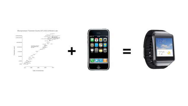
I was working at Google at this time, so I had the chance to try the idea out: I co-founded 20% project and over several years that project morphed and became Android Wear. I’ll talk about that in a minute.
But first I want to point out that this was amazingly prescient of me, right? To correctly predict that this would happen?
No! Not at all! I just looked at the graph and drew a line! Zero brain power required! Looking at the past provides clear hints of what will happen in the future.
By the way, this is one way to have product ideas: look for converging trends. Steal liberally. Some of this stuff is so obvious that it’s not even stealing. Like Henry Ford said, it’s inevitable.

This is how we started off in 20% time, we built some software and got it running on the lock screen of an Android phone and strapped it to our wrists. We explored various ways of developing our ideas.
Lest you think even this was not a stolen idea, look at this.
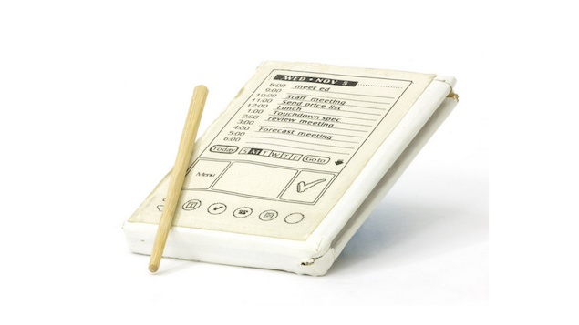
This is a wooden prototype of the first Palm Pilot, from the mid-1990s. A guy called Jeff Hawkins worked at Palm was working on building one of the world’s first portable computers. It’s possibly hard to really appreciate this from our perspective today, but at the time computers were desk-bound. There was no frame of reference for what a mobile computer would be like, or what it might be used for.
So Jeff made this little prototype, it’s a piece of paper glued to a wooden board. And to imagine what it would be like to actually use a device like this, he carried it around with him all day and pretended. So if someone asked him if he was free to meet that afternoon Jeff would whip this piece of wood out, and using a little sawn-off chopstick as a stylus he’d pretend to look up his calendar. He’s count the number of steps it took to complete a task, and try to figure out what was good and what wasn’t. He was trying to figure out what it was like to actually use it.
Rooted MotoACTV Brings Web Browsing And Angry Birds To Your Wrist http://t.co/FlgXefyP by @chrisvelazco
— TechCrunch (@TechCrunch) December 25, 2011Then I saw this story about these GPS sports fitness watches that Motorola built, and that they were actually running Android, and that if you were super-cool you could root them and install your own software.
So we ordered about 10 of them from Amazon and bribed some Engineer friends to help us, and starting hacking our own thing on it. So we thought these Motorola devices were great. Within a week we had something basic working, and a day after in an expensive stroke of luck Google announced that they had acquired Motorola. Fast forward a couple of years and we launched Android Wear.
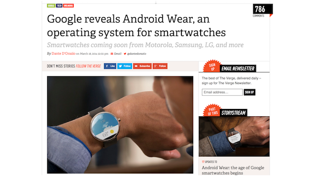
So having a conversation of sorts with the past can certainly be instructive. Although that’s not to say we should replicate the past wholesale. There are plenty of cautionary tales to be found too.
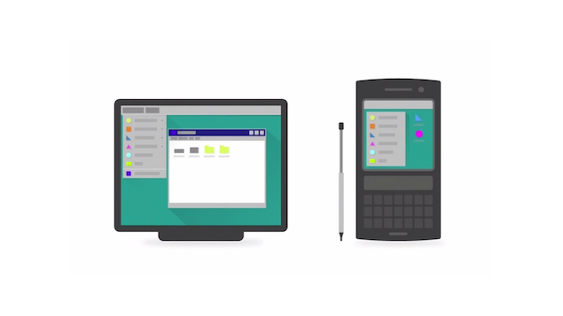
If you looks at the arrival of new devices in the past, it seems like the default reaction is to take what already exists, and port it over. So most early mobile phones adopted the dominant UI paradigm of the day and shrank it down to a tiny screen, menus and pointers and all. It wasn’t until we broke away from this and moved to a model that feels much more native to the new device that smartphones really took off.
Here the past is warning us: a new type of device deserves a new UI paradigm.
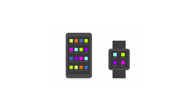
Yet you’ll see the same mistake being made with some early smartwatches. The dominant paradigm of the day being ported over wholesale. So you end up with grids of apps crammed into this tiny screen, but it’s obviously all wrong. Nobody wants to walk down the street swiping and tapping away at a stamp-sized screen looking for an icon.
So, we’re left with a question. If a new type of device deserves a new UI paradigm, what’s the new paradigm for watches? What questions do you need to ask to really go back to first principles?
To start with, what would you do with a wrist computer? What would that even by like, realistically, if you were to think about it as a product designer? What are the affordances, the opportunities?
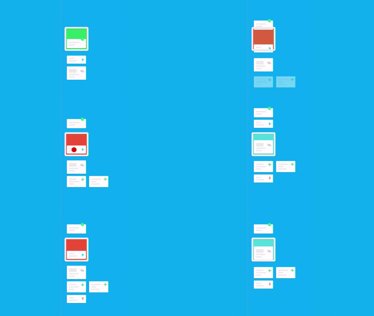
You might come up with something a bit like this. Here’s a fairly simple layout: it’s just a vertical strip of cards. You can swipe up and down on them, and some of them have more info off to the side, so you can swipe over to that. All of this navigating is done with big gross gestures, so there’s not a lot of fine-grained manual dexterity needed. Even tap targets are the entire screen.
And to save you having to hunt for apps, we just remove the concept entirely. Instead the system itself decides what’s important to show based on the sensors on the device and the context that it can detect you’re in. You end up with just the right information, at just the right time, at a glance.
And that’s what we ended up making.
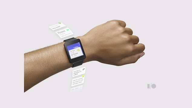
A lot of this started as a way of working around the limitations of a small screen. But one thing we realised was that this in many ways was better. No apps meant no app management: no downloading, no updating, no launching or managing. In many ways this post-app model is much simpler and more helpful.
What’s interesting is that these aren’t just static notifications. They’re somewhere in between really rich, powerful, interactive notifications and really simple, minimal apps. So I can do things with them: I can call a cab, reply to a message, unlock a door, whatever. The important thing is that all of this happens in a common UI, with lots of different apps acting as services, not destinations.
Post app.
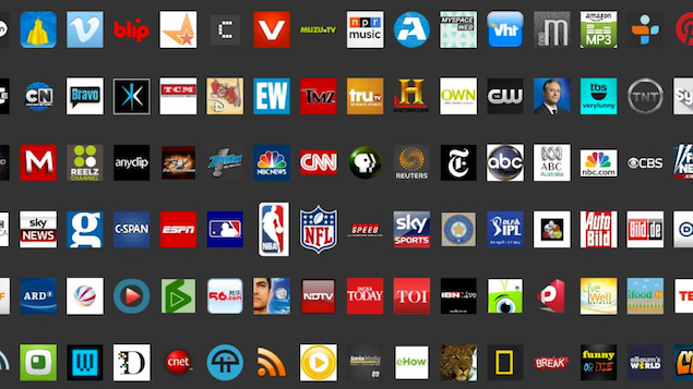
So is that it? Is the post-app future already here? Not exactly. It seems promising, but it’s slow to come.
One thing I learned while working on Android Wear is that it can be difficult to make dramatic changes to an operating system; for example, attempting to make apps redundant on a well-established platform like Android that’s already has apps at it’s centre.
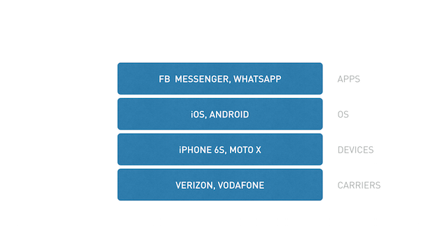
In fact something I came to realise that there are different layers to the computing that we use.
The things at the lower layers, they change very slowly. There are standards involved, and often physical infrastructure to be created. That’s why SMS, a big standard, has been slow to evolve and was overtaken by WhatsApp and others.
But the further up the stack you go, the more open that layer is to big dramatic changes; there’s not too much baggage, things can move much more quickly. At the OS level (so Android or iOS), things are still pretty slow. Yearly updates, long development cycles.
But things suddenly become a lot easier to do at the app level. Many apps update to a new version every two weeks. There’s a ton of opportunity for innovation. It may seem counter-intuitive, but individual apps are actually better positioned to quickly become a platform than Android or iOS are.
And taking this one step further, I’d like to propose that one type of app in particular is well suited, and that’s messaging apps.
Look at the list of the most popular apps in the world. It’s dominated by social apps and messenger apps. All 10 are social in nature, 6 are primarily for messaging.
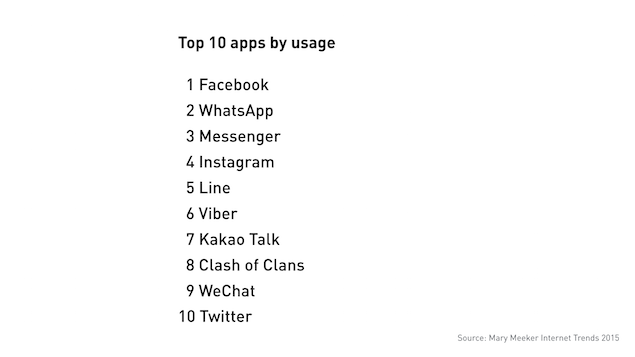
This is despite the fact that typing on your phone is a shit proposition: a tiny keyboard trapped behind a pane of glass and hidden underneath your thumbs.
But we still do it. We message all day long, in bursts and binges. We message family, friends, colleagues.
It’s because we’re humans, and humans are innately tuned to converse. It’s how we share knowledge, it’s how we share emotions. Through conversation. Through dialog.
But just a few years ago this wasn’t the case. The most popular apps weren’t messenger apps. Something massive is happening here, and it is dramatically changing everything that everyone here works on.
I believe that the change will likely lead to these social and messenger apps becoming platforms in their own right - in fact that is already happening. But even further, that these messenger apps may be the operating systems of the near future.
So continuing from this post-app idea that I was exploring with Android Wear, the idea I want to submit to you now is that messaging apps, not the OS, are the perfect host space for these post-app ideas to really come to life. To do that, there are a three things I’d like to briefly recap and draw together.
First, messaging apps are simple, well understood, and massively popular. They work in the way humans are attuned to work, by communicating. They are, simply, a good well-understood interaction model.
At the same time we have Contextual systems. Think Google Now, Siri. These are systems that take in a whole galaxy of information about patterns of behaviour and attempt to predict or guess what I might need; and suggest it to me rather that have me explicitly ask for it. There is a lot of deep technology here, things like natural language processing, machine learning, basic AI, pattern matching algorithms.
The final piece of the puzzle is what we might call push-button services. Uber is the canonical example here. These are basically apps that provide you with a service beyond the app itself. Although there’s an Uber app that you can download from the App Store, that’s not really the product; the service is the transportation that you get. The product is the ecosystem - all of the drivers, the cars. This product and service is what Uber is selling, and the app really only exists as a wrapper. It contains a button that you push to say, “I need this thing now” and then gain access to the system. Where the button lives barely matters.
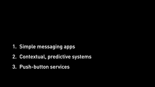
So what do we get when we add these things together? Messaging interfaces, contextual smarts, and access to services.
Well, one thing you can get is an experience where you type what you want into a messaging app, just like you were sending a chat to a friend, but a smart system understands what you’re looking for and routes your request to the right service.
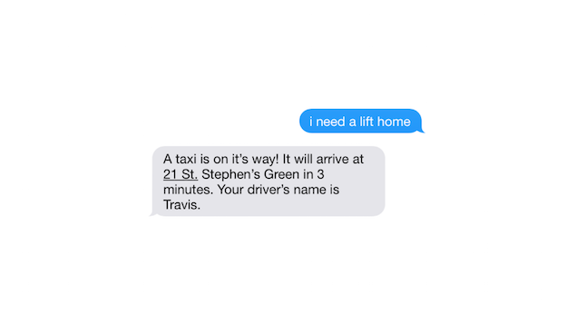
A very simple example of this: you might be able to type a message that you need a lift, the system figures out what you mean, routes it to a taxi company, and messages you back that the cab is on it’s way.
This may seem trivial, but think about it: if I can ask for anything, suddenly there’s a whole host of apps that I don’t need any more. I can interact with the service that the app would have given me access to, and many others, via a messaging UI. That’s kind of amazing.
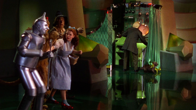
So when you’re doing this typing… who are you talking to? Who’s behind the curtain? Some startups like Magic or Path Talk have banks of support people reading these messages, fulfilling each request manually, and then typing out replies. This is the mechanical turk approach. The Wizard behind the curtain in Wizard of Oz. But there’s another way that I think is far more interesting…

And that’s to use bots. What is a bot? At it’s simplest, it’s a piece of software that runs inside a messaging app that can perform basic tasks. You can think of is as being a bit like Siri, if she were just a friend in your contact list that you could text. So you can send a message to a bot, and it can send you a reply, but it can also do things for you. When you need that taxi, just tell the bot that sits in your messaging app and it takes care of the rest.

Let’s look at a real-life example from Slack. This here is Slackbot, a simple bot that’s already in your contact list when you sign up. So Slackbot will welcome you to Slack, and start chatting with you: what’s your name, your job title, etc. So rather than having to go fill out a profile on some awful web form somewhere before you start, you can do it all inside the conversation. And it’s actually incredibly effective and frictionless and feels totally native to the broader messaging experience.
What’s most exciting about the prospect of bots, I think, is that you can build your own. And they can be really simple to write, often just a little script, and then integrated into existing messaging apps. So suddenly you have the opportunity to build something new right where the action is, inside the messaging apps that people are already using all day every day. You can replace lots of existing disjointed app experiences with something simple. You can already write bots for Slack, for the Telegram messaging app, for Twitter, soon even on FB Messenger.
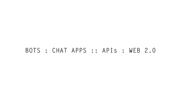
Look to the past again. Think back to the mid-2000s and the “Web 2.0” era. This was a period of huge change for the internet, where the web changed from being static pages to being applications. A huge number of modern tech companies emerged from this period.
One of the defining things of the whole Web 2.0 movement was that a lot of sites like Google Maps or Flickr opened up their APIs, meaning anyone build something else that pulled in data. They morphed from merely being sites into being services. It was huge, and it led to a ton of innovation, because suddenly lots of people could build new things on top.
And that’s exactly what appears to be happening again today. Bots are to modern messaging apps what APIs were to Web 2.0. A way to build on top of other services, experiment, create a new way of interacting with these services. And I expect similar opportunities in this shift.
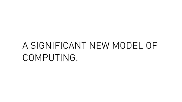
There’s a ton of innovation that can be build on top of these simple ideas. We believe this may be nothing less than the start of a significant new way of interacting with computers. That’s a big deal, as as designers it’s really something to think about. What does it mean to design one of these chat bot experiences?
What role does design have to play here? Today we have all these roles, is conversation user experience the next frontier? “Hi, I’m a conversation designer” is going to be a weird conversation starter.
So what might a conversation designer produce?
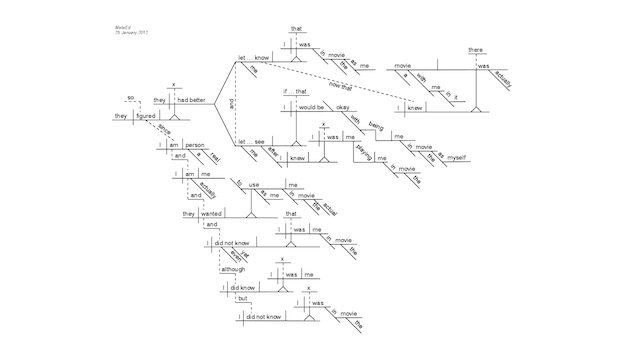
Well, this is a sentence diagram: a method of diagramming sentences to break them down into their structural components: verb, subject, object, so on. It’s like musical notation for words.
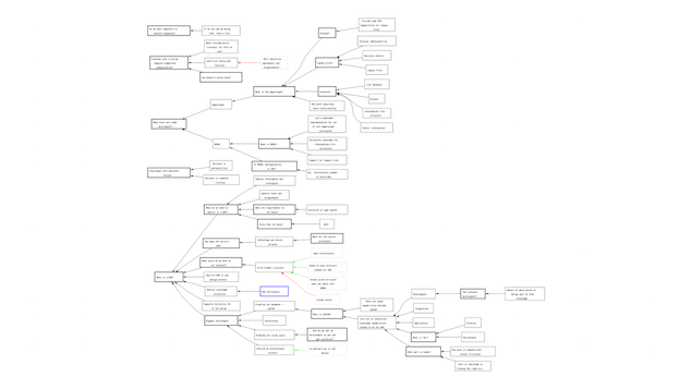
And that’s just a single sentence. This is an attempt to map out an entire conversation: they can branch and flow in all kinds of directions. Crazy stuff.
And by the way, lest you think this is limited to messaging apps, it’s not. There are loads of contexts and inputs possible here.

We’ve got things like Amazon Echo, Siri, our watches, our cars… all of which involve voice input as the sole or main input method. It seems likely that we’ll be interacting with our computers by talking to them or chatting with them.
So this conversation UX stuff seems like it’s going to be hard. How do we even start? Where do we go to steal ideas for?
Wait a sec. This is supposed to be about a conversation with the past right? We’ve been veering dangerously towards the future. All this bot stuff seems pretty out there to me. What can we look to the past to learn from these? In particular, how can we learn about how to design conversations? What else can we look at that can tell us about how this might play out?
Here’s an old Apple concept video from 1987 pitching the Knowledge Navigator:
I’m going to pause it early because A, it’s actually surprisingly boring. “Deforestation lecture notes” is the sexiest use case they could think of? And B, It’s the best case scenario. Even when things go wrong, the system recovers somewhat well.
No, if what you really want is things going badly wrong with technology, you need sci-fi. Again, I’m fortunate here that I can dive into some of my childhood obsessions. Old sci-fi movies have loads to offer here. HAL and 2001 is an obvious one. Don’t let the robot talk you into getting locked outside.
What other warning signs can we learn from sci-fi about the future of conversation UX and how we’ll talk to computers? I mentioned the interaction modes of cars maybe changing. What does conversation look like layered onto that scenario?
Renowned UX Researcher Arnold Schwarzenegger there illustrating the importance of manual override in conversational UI. Where else can we look?
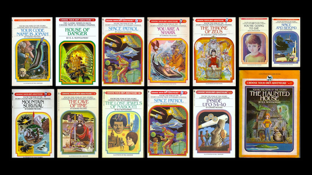
Here’s another childhood obsession of mine, Choose Your Own Adventure books from the 1980s. You probably how these work, on each page you’re faced with a choice and you flip to a different page to continue. They’re branching narratives that change based on how you respond to prompts.
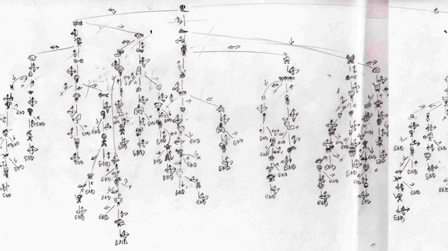
And it’s interesting, people created these intricate maps, that lay out all of the branching possibilities through the game. They came up with this method of diagramming the possibility space.
Another formative part of my childhood, The Secret of Monkey Island (1990). A lot of the interaction in this game is based on talking with other characters, and they say different things based on what you say. A lot of your progress is based on conversation. But the game designers also invented fun touches like insult swordfighting, where you win the fight by choosing the most appropriate comeback to an insult.
What’s happening here is that conversation is used as the base model of a new interaction paradigm; you control the game through conversation.
This last example is newer, this is from an upcoming game called Oxenfree. But I couldn’t resist including this because there are some really interesting touches here, I think, about how to visually display a conversation. It’s ongoing, in real time, augmented. I love this. There’s a ton of ways we as designers can play with ideas like this for presenting conversation in novel ways.
Conversation is something that has existed for millions of years. Millions. And yet here we are still inventing new ways of representing conversation. That’s quite exciting.
What’s interesting to me about all of these examples is that they are all essentially chat bots. They are simulated conversations with a computer or system that in many ways feel like normal conversation, but in other ways they facilitate new types of interactions to happen.
Furthermore, they suggest to me as a designer many new ways of doing things.

There’s a ton of innovation that can be build on top of these simple ideas. I think this may be nothing less than the start of a significant new way of interacting with computers.
That’s why we’ve decided to build a bot right into our main user-facing product, the Intercom Messenger. If you don’t know, the Intercom Messenger is a messaging UI that you can embed in your website or app to chat with your customers.
We call it Interbot, and it’s basically a helper bot that can also be involved in the conversation at certain times.
So all these choose your own adventure writers, and these game designers, what can we learn from them?
Well, taking inspiration from the conversation diagrams we just looked at, here’s a diagram one of our designers, Shek, put together.
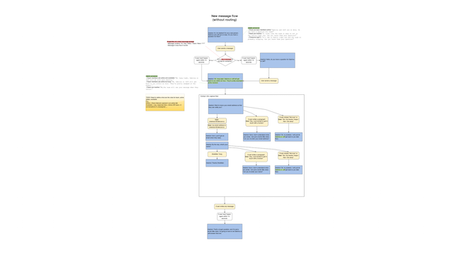
This is basically a state machine diagram for the conversation that you have have with Interbot. If I zoom in a bit you’ll see that these are specific conversation points with branching logic based on what the user responds with.

And if you’re busy when a customer says hi for the first time, a little bot will interject politely and let them know how busy your team is. If you don’t already know their email address, Interbot will ask for that too. At which point the team can then pick up the conversation properly. But boring admin tasks like this is what bots are great for, carrying out little chores, leaving the difficult and meaningful stuff to the humans.
This is just a tiny example that we’re still iterating on, and a lot of this has already changed. But it shows how bots can be useful in all sorts of little situations.
So, Design is a Conversation.
It’s a conversation with the past, of having an inquiring dialog:

And perhaps seeing some part of the future as a result:

It’s about looking at how we’re naturally primed to communicate:

And how that might suggest new ways that we can communicate next:

Of course, this is all speculative. If you look at the past you’ll also see that developing products is a long, hard road littered with the corpses of failed inventors. The good news is that you can stand on the shoulders of those corpses.

So looking to the past, and having a conversation with it, can be a wonderful way of figuring out what types of conversations we may be having in the future.
The irony of standing in front for an audience and droning on about conversation for the guts of an hour is not lost on me. Thanks for listening, and if design is indeed a conversation I look forward to continuing it with all of you afterwards, so please come talk about it and say hi.