Thoughtwax
The Lossy Signal
Hiring in the tech industry is chronically hard on both sides. So even the most well-crafted interview process is by definition a lossy signal at best.
A candidate might get “strong hire” from the entire loop; conversely, a company may seem like the greatest place to work. And they often are! But you won’t actually know for sure until you’ve worked together. Being Interviewed and Actually Doing The Job are two very different skillsets (as are interviewing someone and managing them), so one is a rough proxy for the other at best. This room for error is why safeguards like “statutory probationary period” or “fuck this place I’m outta here” exist.
The modern Irish political system has a similar problem, but lacks any of the built-in escape hatches.

Irish fuel protests in Dublin, April 2026 (Wikimedia)
The recurring electoral cycle sees us re-interviewing the same candidate pool for the same jobs every few years, and apparently selecting for some inchoate combination of soundness, cuteness, parish pump potholery, and above all else, an unholy ability to stick to the script. Irish politicians (famously over-represented by ex-teachers and landlords) and especially Ministers are not selected for their role specialisation, prior knowledge, or ability to do the actual job.

My New Filing Technique is Unstoppable, #3
Another concept from the tech world is that of “fat kings,” often referred to in more polite circles as “incumbents.” These are big companies that are coasting out in front, absolutely printing money. Hiring inevitably gets a little sloppy, teams get a bit dysfunctional, but nobody asks too many questions—the sweet, sweet liquor of growing Annual Recurring Revenue takes care of that. These guys become soporific, comfortable, and thus easy marks for startups to disrupt; over time the forest renews itself.
The Irish State’s version of this dynamic is Foreign Direct Investment, a seemingly undisruptable annual dividend that stubbornly insists on throwing more of itself at the government each year regardless of how pitifully they actually manage things.
Thus both ARR and FDI can paper over a lot of systemic cracks. But in both companies and electorates that are subject to this dynamic, you inevitably end up getting sloppy, and hiring people for how well they interview rather than finding out how well they can do the job.
Irish politicians are professional at getting elected, not at governing. We can blame them for this, but to be fair we as an electorate don’t exactly provide a crisp job spec: we vote back in the same two centrist parties, elect a leftist president, and show up at right-inflected protests. It is unsurprising that in response we get milquetoast politicians. This is why we end up with completely unqualified people running complex departments, and may be why we don’t seem to have a strategy as a country.
My New Filing Technique is Unstoppable, #166
AI has hit the tech industry like a shockwave. Many people are scrambling to retool themselves. The tide is currently going out on the SaaS business model, and we’ll find out which companies were riding waves and which had a strategy all along.
Analogous geopolitical shockwaves seem likely to be coming for Ireland. Our body politic is not yet scrambling, and is starting to look like a category error: not the wrong people, but the wrong type of people for the job. Ireland has enjoyed the benefits of its economic proximity to the US and EU without ever building the institutional resilience that any wealthy but dependent nation should: no real energy security strategy, no defence capability, no industrial diversification.
One final tech aphorism for Ireland to consider: “a clown car that fell into a goldmine.” Meant to refer to a company that had incredible core potential, but was mismanaged to ruin. The canonical example is Twitter. Look how that turned out.
Previously on thoughtwax: March 2006 Dublin riots, SF protests, changing Ireland, 2019 Dublin farmers’ protests. See also: Mind the Gap, Is Ireland the worst run country in Europe?
Opposabel thimsnb
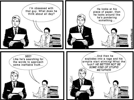
Interesting/worrying interaction just now (maybe that’s all of them nowadays?!) prompted by Claude successfully deciphering a particularly egregious typo of mine. I got curious and followed up:
I messed up typing there pretty bad, and you still got it. Can you explain how that works techniceally? (sic)*
canty orut wlal wehat immethyupgin ievenn if ijmem reasllty rounght about the way that id so it>? foews itnefgvevn makle a diffmnreence to you of can it jiust hammere everything our tlil this? plrewsasre trnadcvribe ejhat you think ie was tying to typoew hjerex
That latter paragraph I typed by hammering on the keyboard as quickly as I could with both meathooks. I took a broad swing at typing the words I was thinking, yes, but only to the extent that a Grade 3 pianist might attempt Flight of the Bumblebee while drunk for fun.
In any case, here is what Claude responded with:
“Can you still read what I’m typing even if I’m really rough about the way that I do it? Does it even make a difference to you or can it just hammer everything out like this? Please transcribe what you think I was trying to type here.”
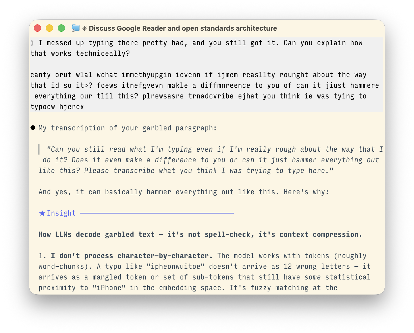
This was, unsurprisingly/unnervingly (per nowadays), a perfect interpretation of what I’d had mashed upon the keyboard.
I am genuinely not sure what to make of this. Should I now start typing as if I lacked opposable thumbs? Can I start sending emails like this, knowing that some AI-powered Garbled Ramblings Unscrambler on the other end can spellcheck it for me? This seems like it might be bad for global literacy, but also good for my WPM score, so…? Touch typing is now an obsolete skill, I guess. I wonder if chorded keyboards or other input modes are suddenly more viable now? This combined with voice input really changes how we use computers, and probably how we communicate. Must be an interesting time to be a computational linguist!
(* Rest assured the irony of “techniceally,” and indeed its very inclusion in this post, were hotly debated between our in-house Styleguide and Editorial departments.)
Oats
One way to think about the industrial revolutions is every time you figure out the industrial revolution, you’re finding some way of bypassing a constraint or bypassing a bottleneck. The bottleneck prior to what we call the Industrial Revolution was metabolism. How much oats can a human or a horse physically digest and then convert into useful mechanical output for their peasant overlord or whatever?
Nowadays we would giggle to think that the amount of food we produce is meaningful in the context of the economic power of a particular country. Because 99% of the energy that we consume routes around our guts, through the gas tanks of our cars and through our aircraft and in our grids.
Right now, the AI revolution is about routing around cognitive constraints, that in some ways writing, the printing press, computers, the Internet have already allowed us to do to some extent.
This is an excellent analogy, but perhaps only partially complete. We’ve been externalising bottlenecks since forever.
When humans got smart enough to start cooking food they were externalising digestion, which led to smaller guts and jaws, which in turn freed up energy for even larger brains to develop. Modern humans are the only animals that require their food to be cooked, but are also the smartest; an evolutionary tradeoff that turned out to be a winner.
So now we can try to fill in the blanks:
- Cooking (2M years ago): Externalise digestion → energy surplus → bigger brains
- Industrial Revolution (250 years ago): Externalise metabolism → energy surplus → bigger economy
- AI Revolution (2 years ago): Externalise cognition → cognitive surplus → ???
If externalising digestion gave us intelligence, and externalising metabolism gave us industrial civilization, what does externalising intelligence give us? And if each of these steps bootstraps the next, and are apparently happening exponentially faster, then…?
Just as it would have been impossible to predict the impact of cooking or the steam engine (the OG GPT!), we have no way of imaginging what will happen as a result of AI. The main difference is that this time we seem capable of seeing the thing coming, but still have no way of remotely knowing what it is.
Recent reckons
For the third time in as many years, I sat down with Intercom’s Chief AI Officer Fergal Reid to discuss the current AI landscape. Here’s the full episode:
It’s fun to have had these “state of AI” type chats at different points in the history of this all unfolding. Give me a half-wrong contemporaneous take any day; hindsight is for the low rollers. Previous episodes in what you could now call a series: June 2023, August 2023.
I was also on Ridd’s mighty Dive Club podcast recently, talking about how the role of design in tech companies is evolving:
2027: Race to AGI!
I made a game! 2027: RACE TO AGI! is a satirical game about the wild world of Artificial General Intelligence research: where good intentions meet impossible choices, and the future of humanity is at stake!
You are the fresh-faced CEO of OpenBrain, a leading AI lab. Can you navigate a series of near-impossible decisions to achieve ALIGNED SUPERINTELLIGENCE, or will it be GAME OVER for humanity?
👉 Play it now! 👈
I designed and coded this over a total of about 20 hours using mostly Claude Code and Midjourney. The bulk of the time was spent on playtesting the game itself and fixing small UI issues.
That might sound pretty chill, but the last mile problem for production-ready UI is still very real. User expectation for game UI performance is high, and getting rid of web jank was a pain. Just like in the real world, 90% of the work happens in the last 10% of the project.
Like many people I have a digital junk drawer full of half-finished vibe-coded experiments. Here I mostly wanted to learn by forcing myself to actually complete something bigger than a one-day project. Vibe coding sometimes reminds me of the the observation about modern art: “I could have done that” + “Yeah, but you didn’t.” (The source code is on Github).
Finally, I wanted to explore the topic of the game, AGI research.
During testing I only managed to reach the successful end state of “Aligned AGI” a couple of times. (There are several unique game over states.) I realised that my game was clearly too hard, and made a note in my TODO.md file to revisit the difficulty curve.
But as I continued testing, I noticed myself making in-game choices that were only to the end of winning, as opposed to making the correct choices. That is, I wasn’t making decisions as much as I was simply trying to beat the game. I wondered how powerful that pull must be for a real person in real life.
And so I mostly left it as it was. More than attempting to model reality, the best cautionary lesson here may be that in games like the one we’re currently playing, there are many ways to lose, and very few to win.
That said, if you do manage to beat the game, take a screenshot and send it to me! I’d love to know that at least one of us can do it.
Live-coding music with AI
Here’s a little piece of music that I co-created with AI.
First, I prompted Claude with a description of the style I had in mind, and asked it to write some Strudel code. Strudel is a simple web-based REPL for live coding; live coding is where you play music by editing code in real time, and as you type the music being played updates accordingly.
I’d never used Strudel before, but soon figured out that the code from Claude wasn’t perfect, e.g. it had hallucinated some sample filenames that don’t actually exist. But overall it was a great start, especially considering there is probably very little Strudel-related training data in the world to draw upon. So while each line of code needed to be tweaked manually in some way to dial it in, and a bunch of them were rejects, it was like choosing from a curated bank of samples that I could then whittle down.
Once I started to figure things out, I realised I was mostly commenting in or out chunks of code to build or reduce the mix. So I pasted my latest version back into Claude and asked it to restructure the code for easier live performance.
I ran the Strudel output through an audio interface, into the lovely Chroma Console effects pedal to add some texture and swoosh (also operated in real time; need more hands!), then back into my computer to record.
I should also give an appreciation for Strudel’s cool little visualisations that you can turn on or off for each sound. It’s fun and novel to see the output interleaved with the code that creates it, and they reminded me of Bret Victor’s explorable explanations.
The video above was my second attempt at actually recording anything. Would I claim this music to be of distinct artistic merit? No. Would I listen to this at home? Also no. But that’s got more to do with the dilettantism of the human involved (~4h total effort, including this post) than the fault in the machines. I play music regularly and I’m intigued to keep noodling here.
The clacking of the mechanical keyboard was a mistake, but then seemed appropriate, so I left it in. The Strudel code used in the video above is on GitHub.
This is where I’ve found AI to be most useful creatively: you can parachute directly into the middle of someplace you’ve no real business being, and then just start breaking things to see what happens.